No, this is not the ordinary designed and featured Woocommerce sites you know. We carefully selected and added it. I may have worked on it for 2 weeks. As a result, a very nice collection emerged. First of all, let me talk about what these 25 Woocommerce Stores contain: We gave priority to appearance and mostly we made comments about design. Functionality is a phenomenon that varies according to each company and company. That’s why the comments below are mostly about design. They may not all be suitable for your industry. Before reviewing these designs below, I listed the design features that a shop site should have under the headings.
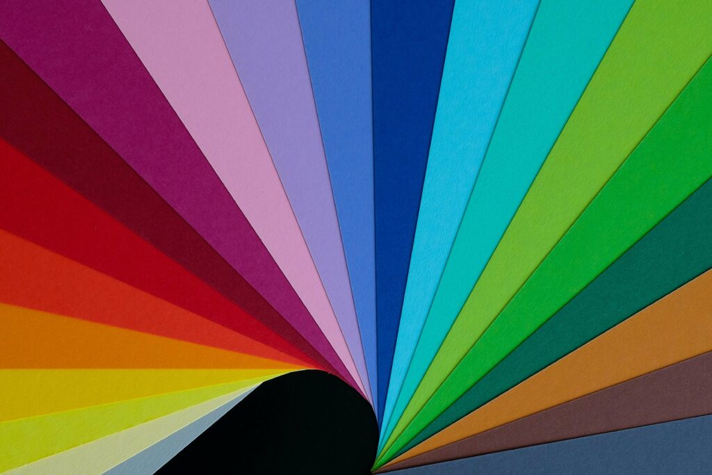
Color
Color is something that affects the mood of the site incredibly because it is an abstract concept, it is a little difficult to explain what it feels like. Everyone can perceive colors differently, but there is a stereotype in general. You can see their explanations everywhere, I will not mention this here, but giving importance to the colors of an e-commerce site is very important in terms of the emotions you will feel. It’s important. You don’t have to use the colors of your logo. You can create your site by turning them on and off or using auxiliary colors. Colors are a very nice tool, but they can be distracting when used too much.
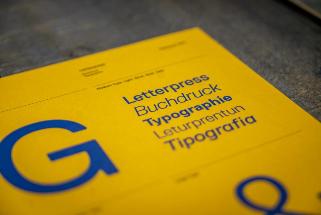
Typography
If they ask me what is as important as colour, I would say typography. They even say that 80% of the design, which the designers have come to a common understanding, is typography. Just like colours have a character, fonts also have a character and when your user enters the site, they are unconsciously affected. It is useful to consider these when choosing fonts. This was the case in terms of price. Also, the fonts have a modern or old-fashioned feeling. There is an Archaic feel, you may want to look modern If you appeal to young people but want to appear as a corporate and old company, maybe it would be useful to use old fonts. This is the site I’ve given below that will help you choose a font Typewolf.

White spaces
I know it’s a bit of a technical thing. I know WooCommerce store owners get their hands dirty too. So when creating a page or asking someone to create one, pay attention to the use of white space. They compare the use of white space to this; When we listen to a beautiful song without spaces in between, it means nothing to us, but the spaces between those notes make that music beautiful. Something played back and forth is noise, but the spaces inserted and the notes pressed create that music. It’s the same in white space. They may be confused. This noise may disturb them. Do not try to squeeze everything into one place, now there is a phone, and people are scrolling. Really.

Photograph
I don’t know about you, but when I’m going to buy something, photos are very important to me. Your photos don’t need to be of incredible quality, but the user should be able to see what they are. Let me give you a good example; For example, if I can’t perceive the size of the photo, that photo is not successful for me. I saw a souvenir product and they put a coin next to it. So that you can perceive the size of the product.
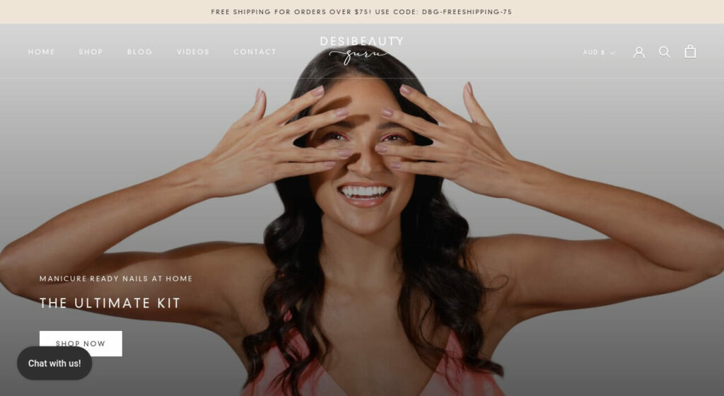
1-DesiBeautyGuru – Fashion
- One-page checkout on the homepage is great
- Clean design
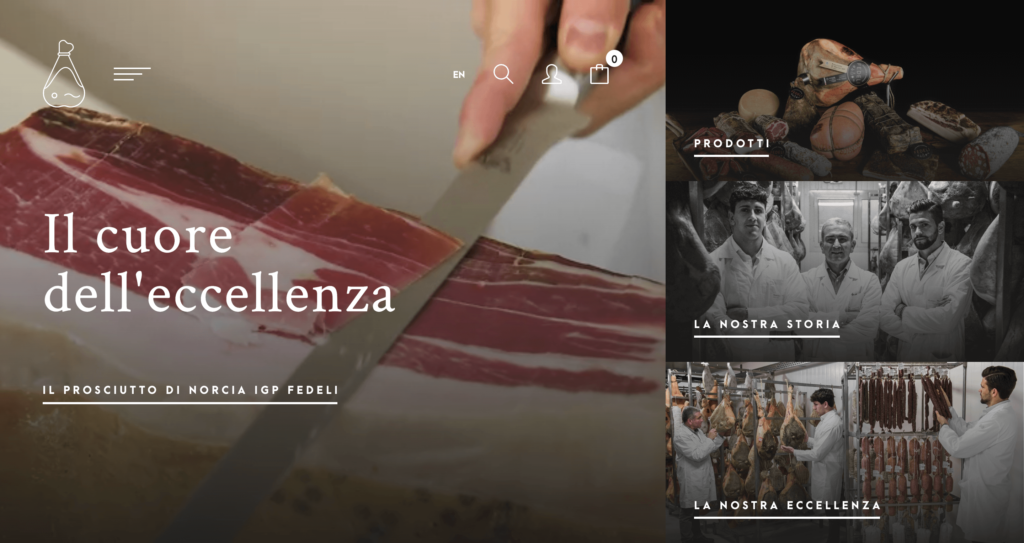
2-Fedelieccellenze – Food
- Awesome dark design
- Good photography
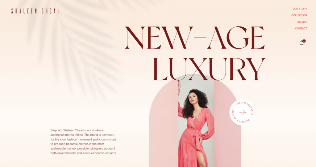
3-Shaleen Cheah – Fashion
- Luxury Design
- Good pastel colors
- Good use of a white space
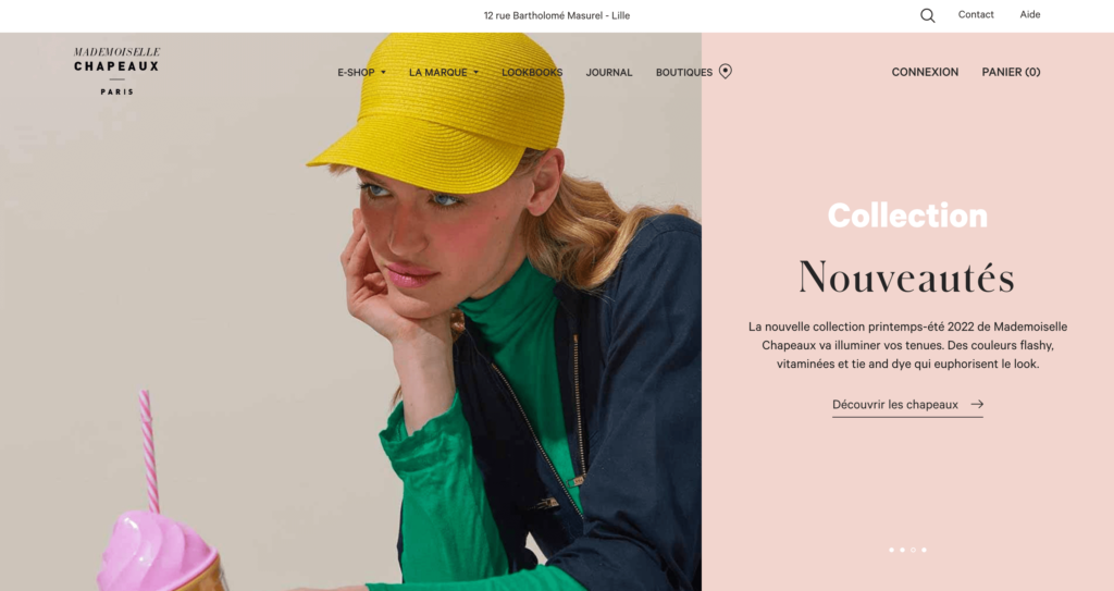
4-Mademoisellechapeaux – Fashion
- Good pastel colors
- Good usage of white space
- Fashion
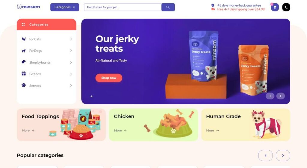
5-Minsom – Animal
- Viewed colors
- Energetic design
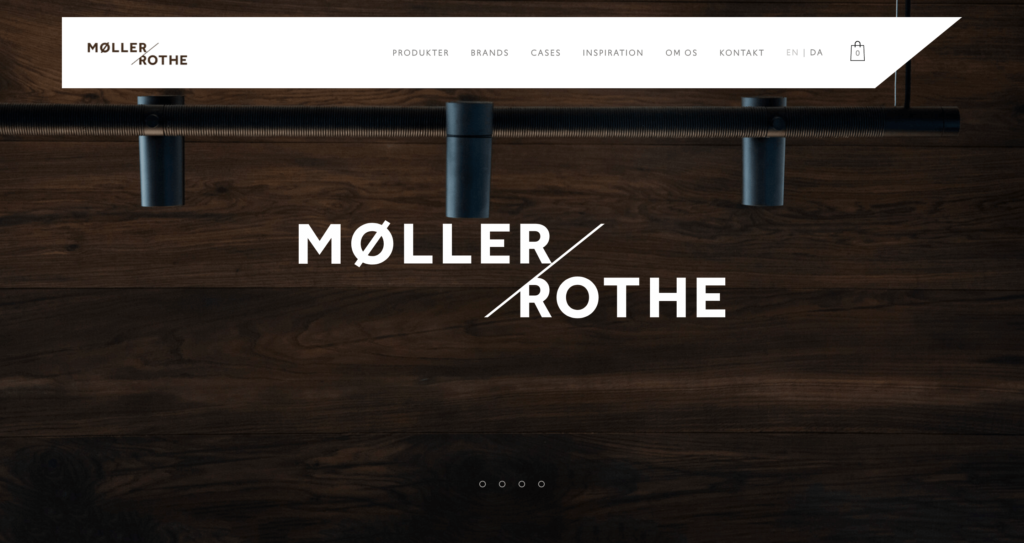
6-Mollerrothe – Home
- Elite Design
- Good photography
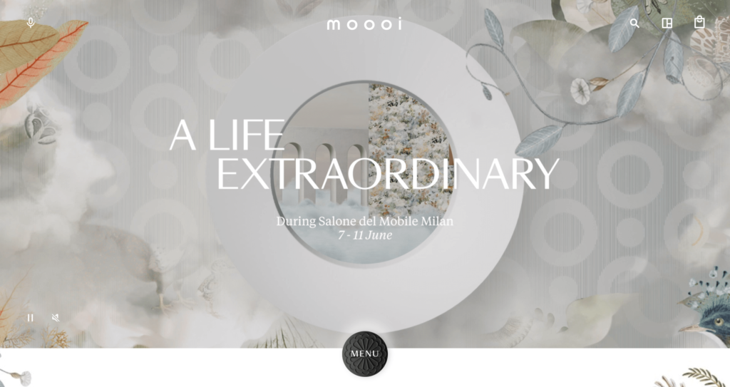
7-Moooi – Home
- Great animations
- Awesome colors
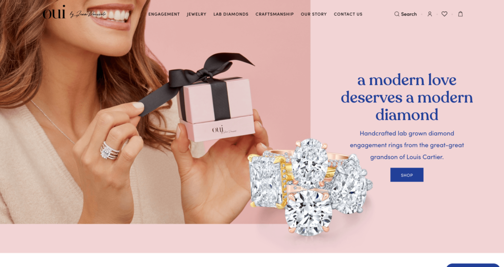
8-Eandousset – Fashion
- Great colors
- Awesome fonts
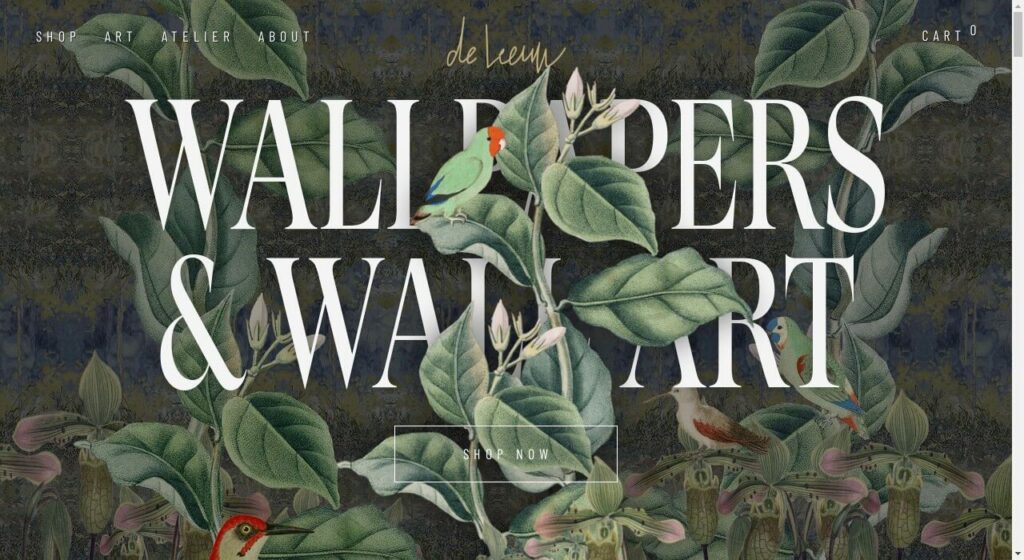
9-Steffiedeleeuw – Art
- Fascinating typography and fonts
- Great colors
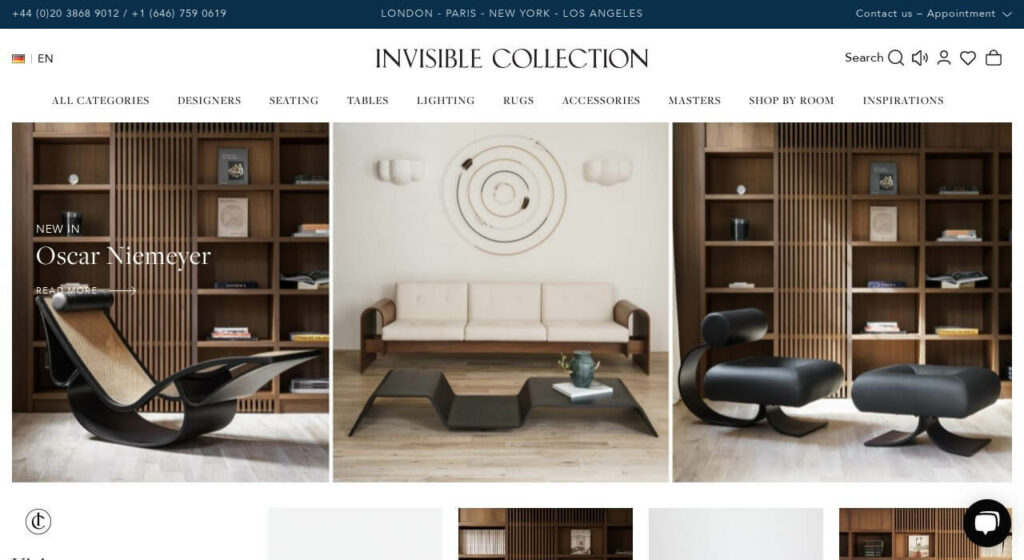
10-Theinvisiblecollection – Home
- İntimidate design
- Crowded but elite design
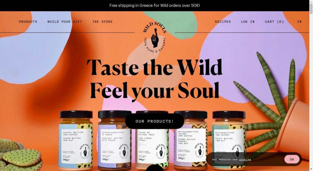
11-Wildsouls – Food
- Great and viewed colors
- Awesome photography
- Good animations
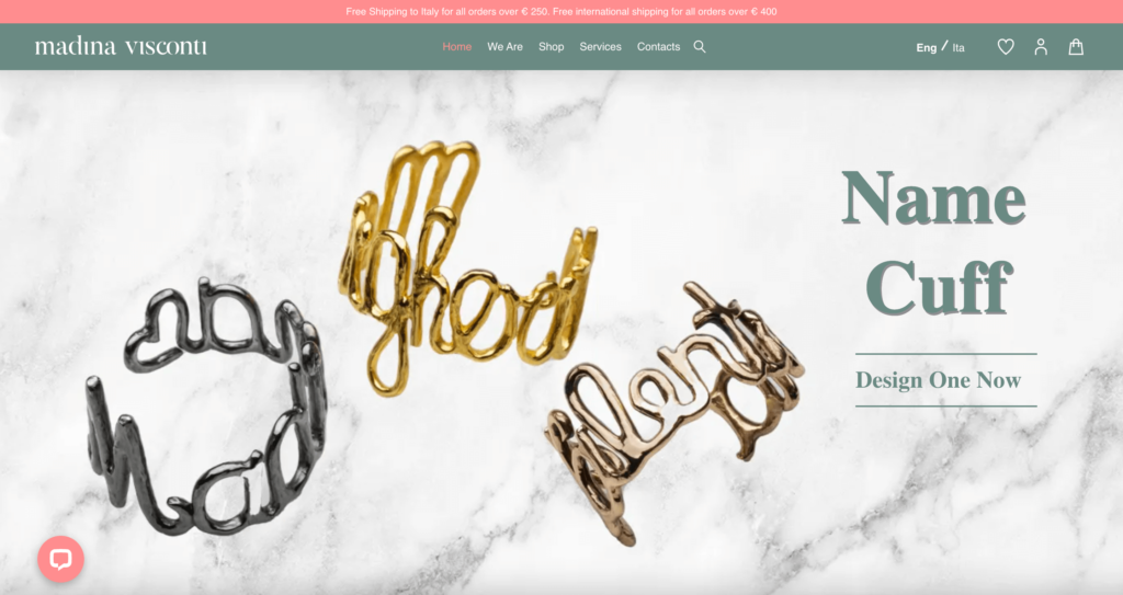
12-Madinavisconti – Fashion
- Clean category filter
- Great background-color
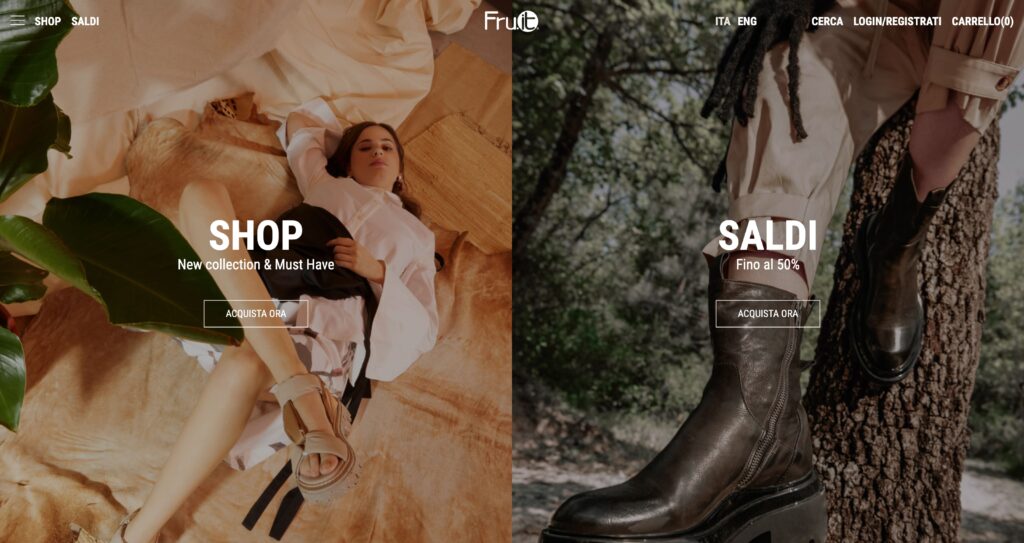
13-Fru.it – Fashion
- Great category listing
- Vivid colors
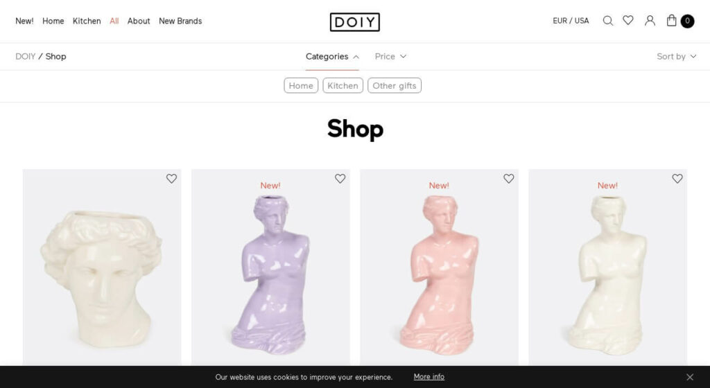
14-Doiydesign – Home
- Great white space usage
- Nice Product Images (on hover)
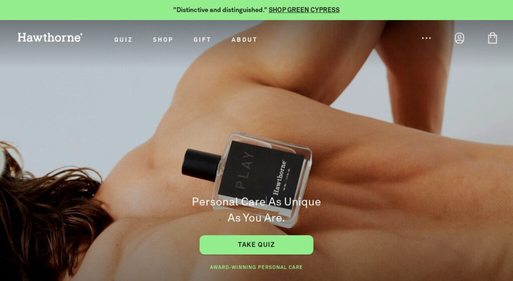
15-Hawthorne – Personal Care
- Elite Look, great brown color
- Great category design

16-Studio-job – Creative
- Fun Design
- Great Animations
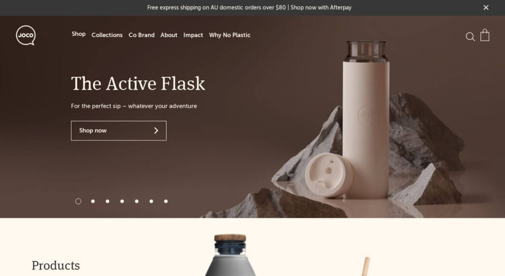
17-Jococups – Health
- Class and Elite design
- Greate Photography
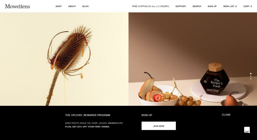
18-Mowellens – Health
- Look fashionable
- Liked the fonts
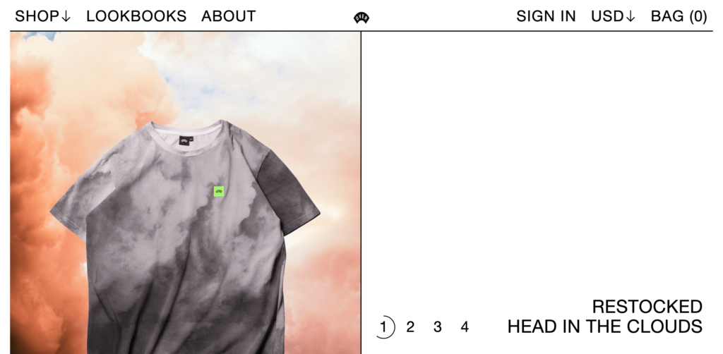
19-Overclothing – Fashion
- Brutal Design
- Cool Product Page
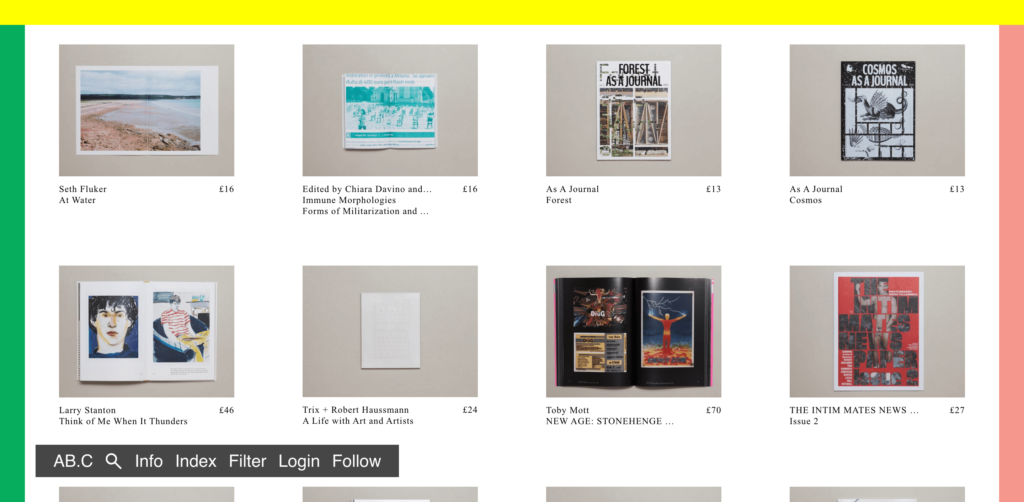
20-Antennebooks – Publication
- Avant-garde Looking
- The product page on a pop-up
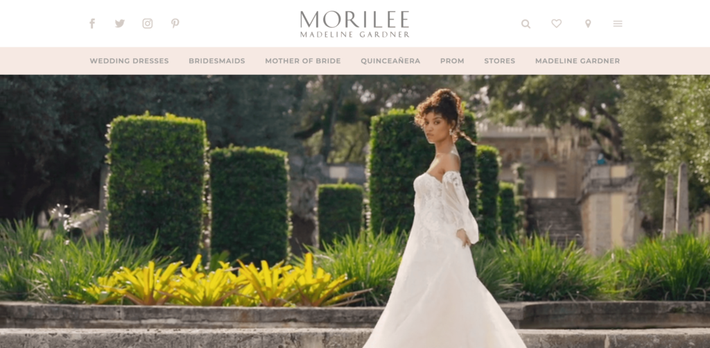
21-Morilee – Fashion
- Big Photography
- Great product listing
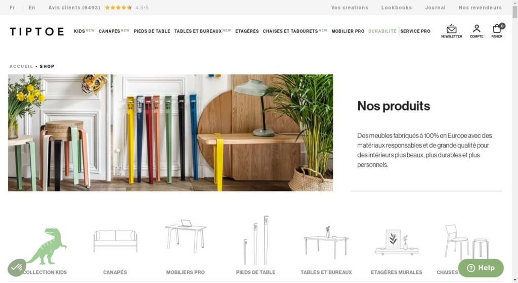
22-Tiptoe – Home
- Good Carousels
- Good Font usage
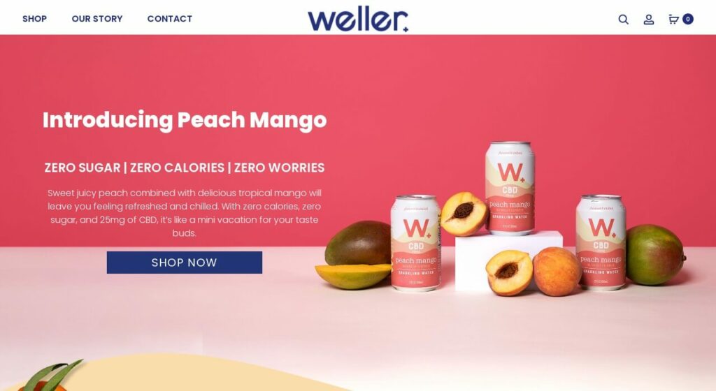
23-Welleryou – Food
- Warm Colours & Energetic design
- Look fresh
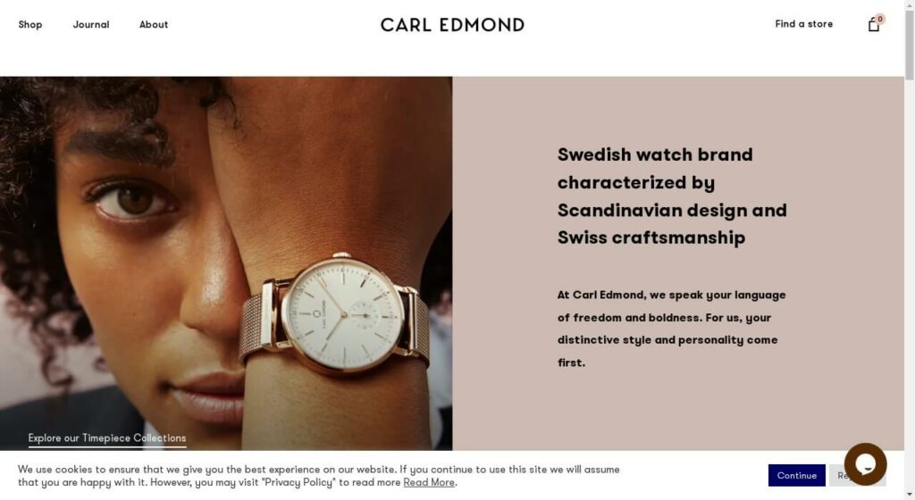
24-Carledmond – Fashion
- Luxe looking & Elegant Icons
- Good Product Page
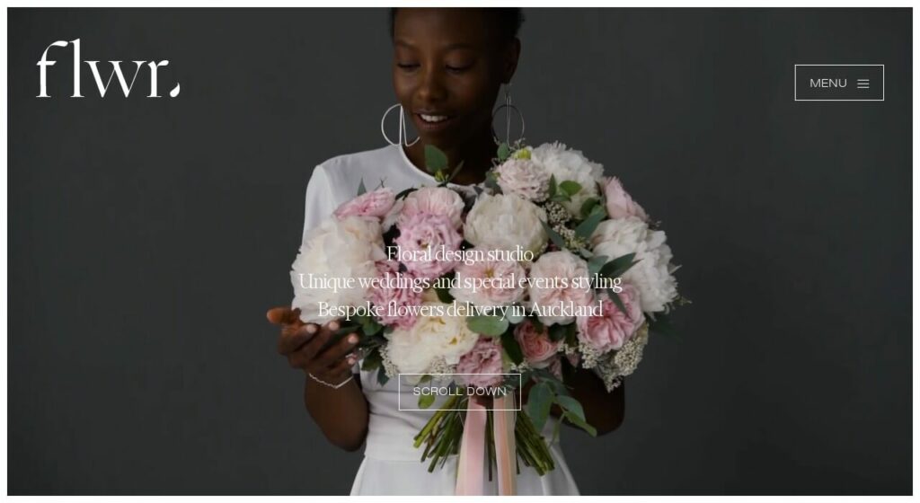
25-Flwr – Fashion
- Great Typography
- Good Imagery
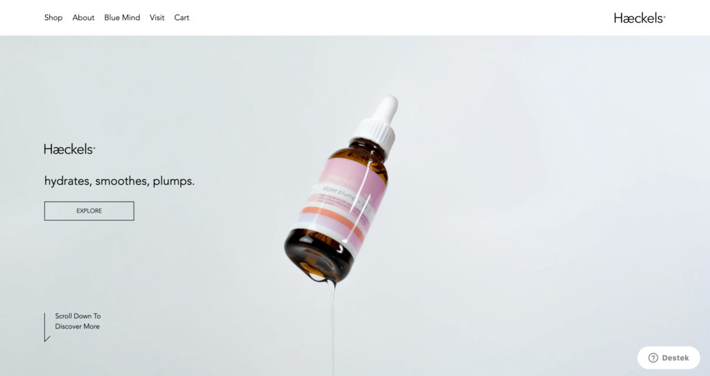
26-Haeckels – Personal Care
- Neat pastel colors
- Great white-space usage
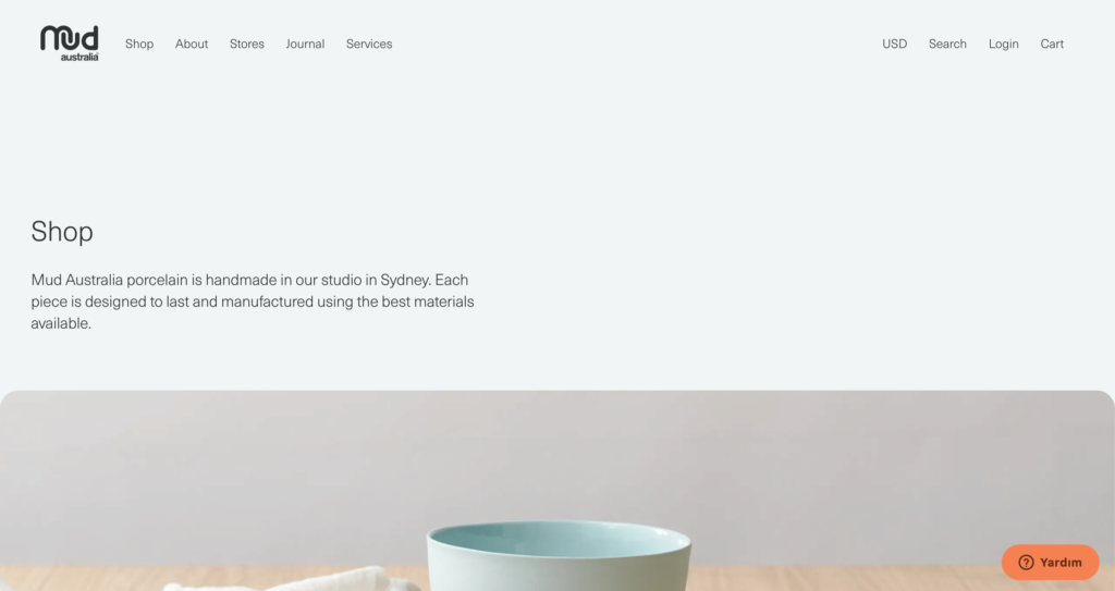
27-Mudaustralia – Home
- Neat card design
- Awesome Photography
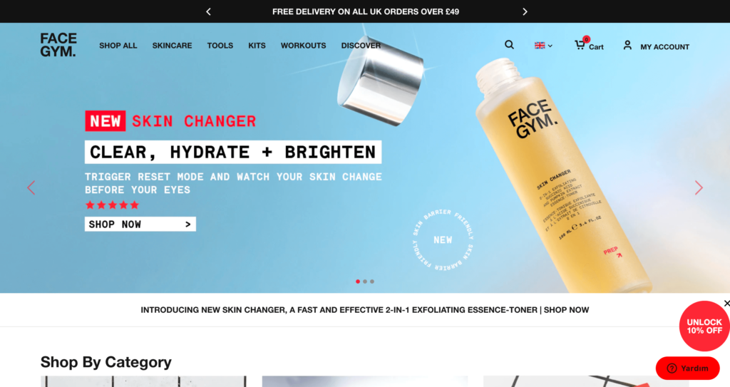
28-Facegym – Personal Care
- Clean Design
- Awesome Mega Menu
Conclusion
You see a bunch of WooCommerce example stores. And I explained why I pick them. Do you have sites that inspire you while you building your site? Please share with us.


