69.5% of all shopping carts are abandoned on e-commerce websites around the world. The truth is that if you have an online store, you lose sales due to cart abandonment. And a long and complicated checkout process is one of the biggest reasons for cart abandonment. You’re here because you want to improve your checkout page. I appreciate your effort. Here, I’ll introduce the best WooCommerce checkout examples.
But first. Let’s talk about WooCommerce default checkout page.
We know WooCommerce default template is.. how can I say this kindly… Not the best when the topic comes to UX and conversion. Some agencies (we listed above) take the experience one step ahead and do some custom checkout processes. You can take inspiration from them and improve your checkout page.
Don’t worry. You don’t need to spend $$$$ to improve your checkout process. There are some great themes and plugins to improve your checkout funnel. We’ll also review them at the end of the article. So those guides will help you to achieve that dreamed checkout process you can’t imagine of.
Take your coffee and start reading.
12 Great WooCommerce checkout examples
These are the sites that have a good checkout page. I can’t say it’s completely perfect, but I wanted to show you a variety of designs instead of repetitive designs so I could give you more variety examples. Pick your favourite checkout page example and try to apply it to your site. Don’t hesitate to reach us since we’re pretty good at checkout optimization. Can’t be humble here 😎
Those examples are not just user friendly, at the same time they are converting well and successful checkout page.
Note: The order is random. I don’t want to race them since every one them are for a different purpose and may be in a different sector.

1- GALLINÉE – Good design converts well
Navigation and distractive elements have been removed from the checkout page. The coupon is hidden behind a link. This is important because if it attracts attention, our visitors may leave our site with a better opportunity while searching for coupons.
Best Checkout Page Practises
- Distraction-free checkout page
- Good Design
- Account creation is easy
Checkout Page Mistakes
- There is no label on billing and Credit card section
- Shipping don’t give any information about delivery date or time
- Mobile optimization is not great. The products in the card can be visible on the top and can be hide behind the click.
- There is no secure signs around the payment section.
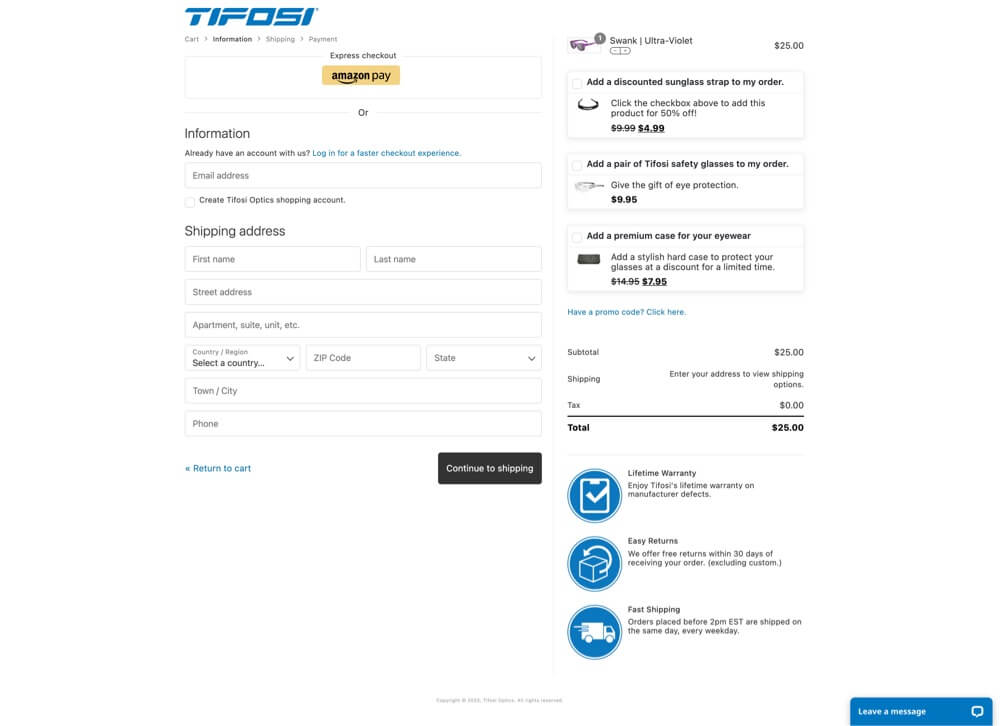
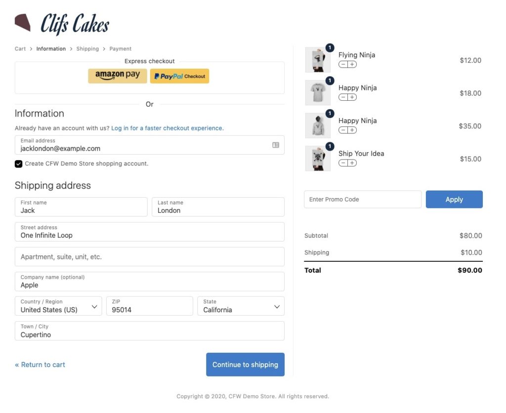
2-TIFOSI – Shopify Like Checkout Page in WooCommerce
With its Shopify-style checkout page design, TIFOSI has already earned the right to be on this list. You know Shopify has a well-convert checkout page and most WooCommerce users are trying to apply it to WooCommerce. If you want to have a checkout design like Shopify, CheckoutWC plugin is for you.
Anyway, let’s continue to review TIFOSI.
The express checkout feature is great and well taken care of. Suggesting related products is a nice feature that increases the basket value. We can’t say it’s super in terms of design, but it’s good in terms of functionality. This is one of the best WooCommerce checkout examples here.
Best Checkout Page Practises
- Express Checkout feature
- Distraction-free checkout page
- There are signs to convince customer to buy
Checkout Page Mistakes
- 3 products might be too much as a suggestion
- Not a great design
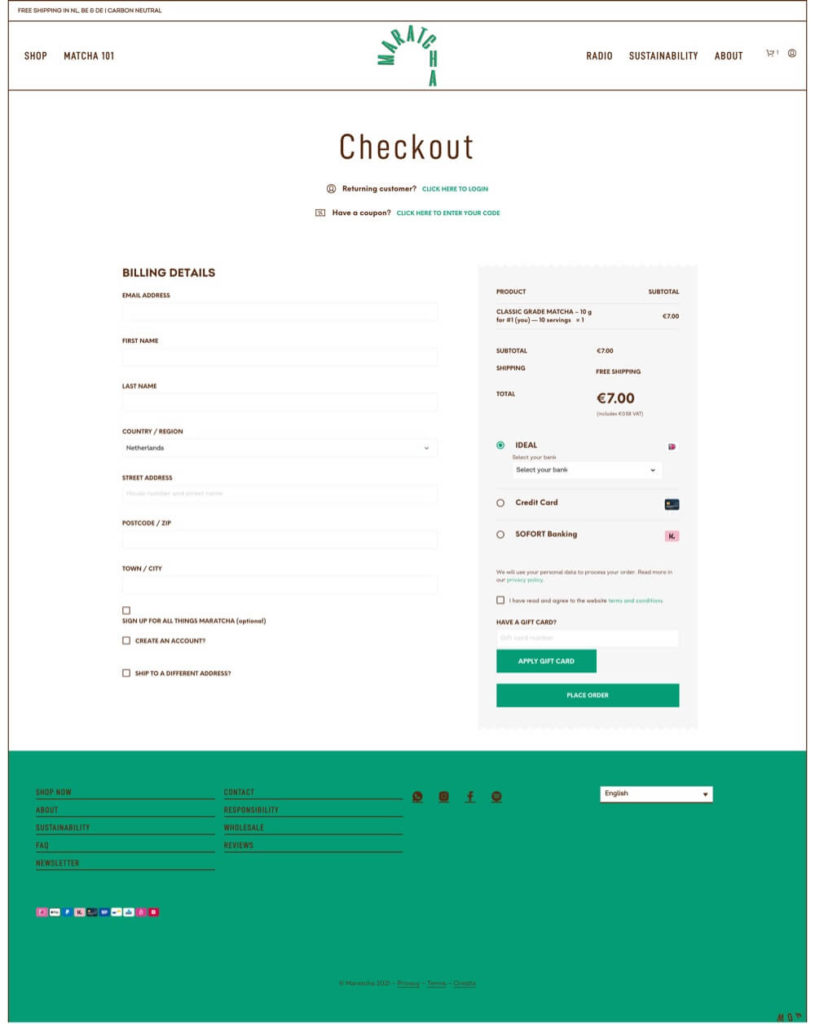
3- MARATCHA – Nice Touches
A store with a beautiful design attracted us. His skilful use of space in the design seems successful enough with the paper tear shape resembling an invoice. I am sure that these simple touches added to the default design of WooCommerce make the user feel good. It’s fine that it allows guest checkout.
But I see problems in a few places. There is a coupon area above and a gift card area below.These two areas are both very distracting and confusing. Mandatory fields are not specified in the design, it is not clear what the user has to fill in. Instead of labeling the name and surname separately, it could be listed as a full name under a single field. Newsletter subscription comes checked, smells a bit dark UX, and dangerous.
Best Checkout Page Practises
- Good design
- Allow guest checkout – Account creation is easy
Checkout Page Mistakes
- There are distractive elements
- Gift Card is confusing
- Form doesn’t let us know which one fields are required
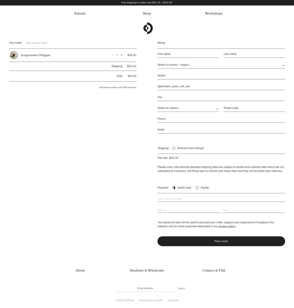
4- 3rdritual – Elegant design
It welcomes us with a completely different design. It is quite difficult to guess that it is Woocommerce. The design looks simple and elegant. The call to action is very clear. While the credit card field is being filled, the user may forget what this field is about.
It is very smart to ask for a different address for the invoice next to shipping.
It is quite difficult to find a problem in this design. Maybe something like this I may have a criticism. All fonts have the same weight, it’s a little difficult to distinguish what is important and what is not, but I can say that the coupon code is very well hidden.
Let’s take a look at mobile. Mobile is pretty clean, label fields are also problematic on mobile. If you forgot what this field is about when you click it, you need to delete what you wrote so you can see what this field is about.
Best checkout page practices
- Simple and stylish appearance
- Distraction-free checkout page
- Perfect place to enter a new address for billing address
Checkout page mistakes
- Use of wrong labels
- Poor use of visual weight
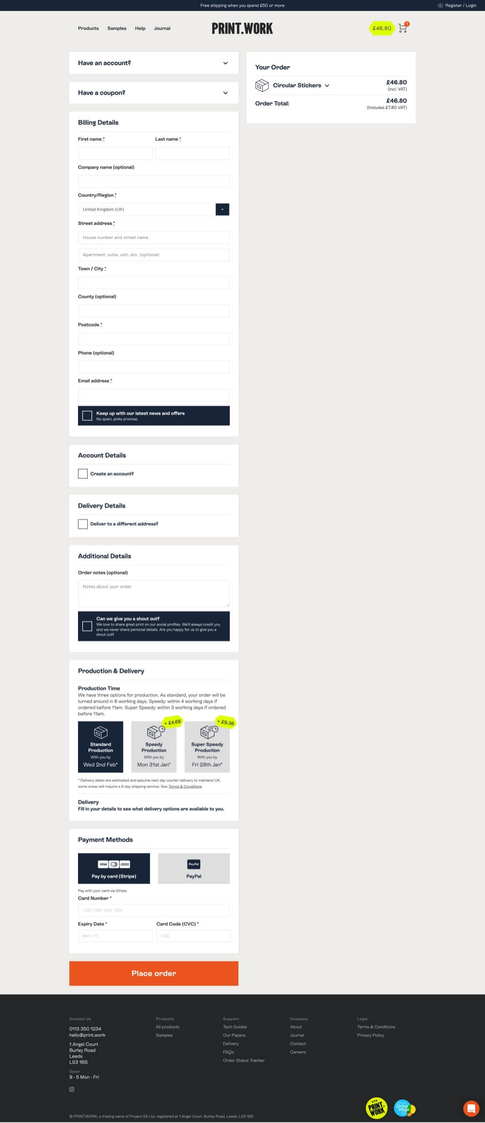
5- PRINT.WORK – The best checkout page in the list
Yes, welcome to the best checkout page on our list. The design is excellent. The functionality is excellent.
The information in the cargo section is very good. The use of labels, which is somehow omitted in most beautiful designs, is fine. One issue is… There is a little too much text.
It is very polite to ask for permission for the offer with a box below when entering our e-mail address. Normally, most sites do this without asking for permission.
It’s nice that when you click with the order detail on the right, it gives the details in a very good design. It hides the unnecessary fields behind a click.
Best checkout page practices
- Perfect UX
- Using labels in forms
- Showing the date it will reach us on shipping
- Distinctive call to action button
- Nice display of Spect details
6-AllMaters – Step by Step Checkout applied well to WooCommerce
Allmaters.com also has a check out process that will make it into the top 3 on this list.
Using a step-by-step process on the checkout page is perfect. You know, having too many forms can intimidate the user. This can result in abandonment. And this website prevents this to show a small amount of fields by each step.
Here, too, a distraction-free interface welcomes us. And I think the design need not be mentioned, I really like it.
The screen to confirm the information you entered in the last step is fine.
You can’t imagine this checkout process built on WooCommerce. The items given below are intended to persuade the user and are very good.
Best checkout page practices
- Providing the opportunity to shop without intimidating the user with steps
- Distraction-free checkout page
- Promoting satisfaction guarantee
- Nice and elegant design
7-Campos Coffee – Great step-by-step Checkout Page example
This is a subscription site. I would definitely recommend you to browse the product page. They offered a very good experience with the design.
If we talk about the checkout page, it is good that they have a step-by-step checkout page on the left side.
It is very good that they use google API in the address section. In this way, users can quickly enter their addresses.
Each checkout step can be quickly edited later. The use of labels in the payment section is problematic.
The promo code could be hidden behind the click. But overall it provides a good experience.
Best checkout page practices
- Steps can be editable later
- Information to be on the left in a gradual manner
- Using google API in the address section

Checkout page mistakes
- Problematic label usage in the Credit Card section
- Promo code could be hidden
8-The Cool Hunter – Great Subscribtion checkout page
The cool hunter has a unique design. I definitely recommend you to visit the shop pages.
If we are talking about the checkout page, the purchase link as a visitor is very passive in today’s world, the first thing most users look for is to buy as a visitor, it is better for the user to put it in a more visible place.
This Website has succeeded in showing the labels both aesthetically and without any problems in terms of UX. Required fields are marked.
The step-by-step checkout process has been implemented very successfully, the previous option can be easily changed. The payment step is well implemented, no UX problems.
Card verification is done. This is a good thing because the user may have mistyped the credit card number, so the payment fails, he has to repeat all these steps, the best solution is to give the error directly in the relevant field
It has been implemented very successfully on mobile as well.
Only the checkout steps can be mixed with the footer. One of my favourite features is that they place the contents of the cart under a tab at the top, just like in Shopify.
Best checkout page practices
- Shopify Style Checkout
- Credit Card Verification
- Great Design
4 Best Plugins to Improve Your WooCommerce Checkout Page
WooCommerce Checkout page is one of the most important pages as you receive payment from your customers at the checkout stage. In this step, you need to design the checkout step for customers from each niche and bring it to a user-friendly design. Otherwise, in the slightest unfavourable situation, you may lose your potential customer without paying.
There is a Checkout page that Woocommerce provides to users. But in some cases, you may need to edit the structure and you need to make sure that this structure works in harmony with your payment screen. One of the best ways for such a situation is to use a plugin.
In this topic, we will introduce the best WooCommerce Checkout page builders we have listed for you.
1. One Page Checkout Suite – Free
WooCommerce One Page Checkout displays all elements of a standard checkout on a single page, such as customer information, product image, shipping options/method, payment information.
Customers can easily add or remove products, select the number of products and complete their payment without leaving the page. It helps customers save time and improve their purchasing experience while shopping online.
Want to maximize your response rate without being charged? One Page Checkout Suite plugin is for you 🎉
With the Single Page Checkout feature, your customers can easily complete the payment step. Your conversion rates will increase compared to the default WooCommerce checkout design.
You can integrate the WooCommerce One Page Checkout plugin into your site within minutes and start using it. All you have to do is to create an account from the plugin site. Then you can have the plugin for free.
Speed is definitely the top priority when it comes to WooCommerce Page Checkout. On slow checkout pages, most users leave the page. In this case, it can cause irreversible problems for your business. Since the plugin is designed to be a cloud-based platform, it offers users a lightning-fast and always-available structure. While WooCommerce’s checkout feature focuses on many aspects of your site, WooCommerce One Page Checkout focuses only on your customer’s checkout steps, making it extremely fast and reliable!
Key Features
- Mobile Optimized
- Fast Payment Method Integration
- Ease of Use
- Getting 24/7 Support from Dominate

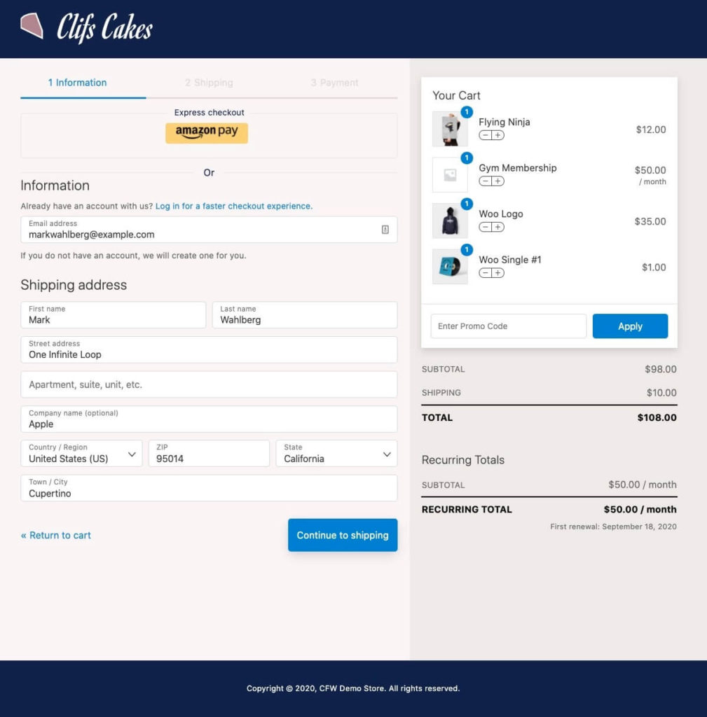
2. CheckoutWC – Paid
CheckoutWC plugin is a WooCommerce plugin that works with WordPress themes and offers responsive WooCommerce checkout templates to users. These fundamentals aim to increase the user response rate by making your checkout page more user-friendly.
You can create a similar WooCommerce checkout page like Shopify, one of the world-famous and best e-commerce infrastructure, and thus present a proven WooCommerce checkout page to your customers.
CheckoutWC divides the purchasing process into 3 steps so that users are not exposed to many input fields at once. Thus, the customer is less confused during the purchase process and increases the rate of successful checkouts.
Another great feature this plugin has is the WooCommerce checkout page also simplifies the account process by allowing one to create an account without any additional information. If the payment is successful, the new account information is sent to the e-mail of the customer. If your customer who will make the purchase already has an account, it offers the chance to log in instantly at the payment step. In addition, with CheckoutWC, users can make purchases as guests.
In short, this is one of the best WooCommerce checkout examples here.
4 Different WooCommerce checkout templates
Tutorial Video for making your WooCommerce checkout page look like a Shopify Checkout
One of the important points of the CheckoutWC plugin is that your WooCommerce checkout page is global. With this plugin, the country and city fields are automatically populated according to the zip code. In addition, if the user refreshes the page for any reason, the visitor does not need to fill in the previously filled fields.
It works compatible with the most used plugins developed for WooCommerce.
To give a few examples of these:
MonsterInsights
Checkout Add-ons
One Click Upsell by WooCurve
Google Analytics Pro
Facebook for WooCommerce
WooCommerce Google Analytics Integration
Order Delivery Date Pro for WooCommerce
Molongui One Click Upsell For WooCommerce
Click here for more
Key Features
- Mobile Optimized
- Express Checkout
- Ability to change cart content
- Customizable Layout
- Shopify-like Checkout page
3. WooFunnels – Paid & Free
If you are looking for a WooCommerce checkout page builder, WooFunnels is for you. There is even a free version available so you can try the plugin.
WooFunnels works with the most used site builders worldwide like Elementor, Divi, Oxygen.
All you have to do is choose the site builder that you actively use on your site.
You can create payment steps if you use the WooFunnels plugin. You can make offers that users can accept with one click. WooFunnels also has prebuilt templates for you that are 100% mobile optimized and look great on any device.
Apart from the templates it offers, the WooFunnels plugin focuses on increasing the rate of successful checkouts. It offers a distraction-free layout for this. With this structure, customers who will make a possible purchase pass from one step to the next without any exit point in the payment steps. It also presents customers with offers that they can accept with one click, by showing relevant offers before and after purchase for higher order value. With WooFunnels marketing automation, you can bring back abandoned users to complete their purchases and achieve a higher conversion rate.
WooFunnels also has a checkout template like Shopify.
Key Features
- Performance Panel created for reporting
- Abandoned Cart Tracking
- Pre-made Checkout Page templates
- Do Timely Follow-Ups
- A/B Testing
- Rule-Based Order Bumps
- Funnel Automations
4. Elementor Checkout Widget
If you are using Elementor for E-Commerce, it is quite easy to have a WooCommerce checkout page that is both attractive, interactive and easy to use for your site visitors.
The checkout page is the final and important step in the purchasing process, where users enter their address and billing details. Boring and complex checkout pages often lead to payment abandonment. Such pages can reduce your online business income.
Elementor offers an easy way to add advanced features and customize the design to your WooCommerce checkout page. You can have full control over the checkout page and improve it.
Compared to the 2 plugins we mentioned above, Elementor Checkout Widget is simple to learn and use. It is also 1 step ahead of the other 2 plugins in terms of performance.
Key Features
- Elementor Official widget
- Compatible with other themes
- Customizable
- Good Performance
- Compatible with Other Plugins
Conclusion
We listed WooCommerce checkout examples in this article. Now, please think. Is WooCommerce’s default checkout page sufficient for your business?
WooCommerce does not offer you the best possible checkout experience for your checkout page business.
Depending on the change you want to make, the level of experience and the products you sell, you can optimize the checkout flow using WooCommerce plugins, page templates or shortcodes.
Before I finish the article. I would like to suggest this page to customize your WooCommerce checkout fields.
What plugin or method are you using to improve your checkout process?